
Explorations in Fiber Art
Explorations in Fiber Art grew out of Women’s Journeys in Fiber Art after Jan Gerber retired in 2023.
Women’s Journeys in Fiber
In 2010, I joined a talented group of textile artists who collectively represent Women’s Journey in Fiber, founded by Janette Gerber. Each year there is an Annual Project with a theme. We all begin with the same Project Statement and share our work at meetings as the project progresses. An Artist Statement is required with each finished piece. Please visit our website www.womensjourneysinfiber.com to learn more about our group and the exceptional artists it represents.

Trees: Habitat • Roots • Growth
Rings of Reflection
A tree's history is in its rings. Each one tells a story: forest fire, sunshine, drought, or rainfall. Life coasts along with ups and downs. Here is my remembrance of 65 years.
Process:
The top and bottom are constructed with Pellon then covered with flannel I botanically printed. The sides are my botanical printed cotton. The rings are hand embroidered and machine stitched. The shape was then stuffed.
Photo by Kathleen Cunningham
Connection: Natural • Personal • Technical
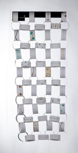
Our Most Basic Link
A paper chain is as simple as a childhood activity or as expansive as the idea we could still be breathing the same air as our ancestors. “Over seven billion people, billions of plants and animals are all breathing right now —still breathing the air of our ancestors.” (Unknown). This quote inspired me to reflect on the ways we are simultaneously united by this fundamental part of life. Different elements on the links (marks, colors, and embellishment) depict how all living things are connected by the air we breathe.
Process: 100lb paper marked with botanical inks, hole punched and stitched with natural dyed perle cotton.
Photo by Patrick Fraser
Color: Emotion • Interaction • Energy
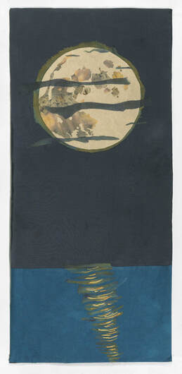
The Moon’s Reflective Energy
For centuries people have been drawn to the colors, mysteries and energy of the moon. Blue Moon, Blood Moon, Harvest Moon… the lunar cycle from new to full and all the phases in between. The relationship between the moon and water as seen in the ebb and flow of the tide cycle. At sunset, the moons’ reflection on the water draws me in. The beautiful colors and calming sound of the waves against the shore call to me--Come sit on the sand and be embraced by my energy.
Process:
Black is hand dyed silk. Moon and reflection are printed with botanicals, sabraset and natural dyes. Water is cotton dyed in indigo. Fused and machine stitched.
Photo by Paul Lane
|
Pathways: Dream • Explore • Discover
Garden Paths This is my imaginary Japanese-style garden. I incorporated some of the aesthetic, symbolic, sensory and spiritual dimensions of a traditional Japanese garden into my piece. Rocks, plants and water; an active engagement with nature; asymmetry; simple groupings; stepping stones (dictate movement along the path); stones representing three forces: horizontal, vertical and diagonal (heaven, earth and man); a sekimori ishi (boundary-guard stone). These principles grounded my vision for this work. I invite you to explore this space. We are so fortunate to have a Japanese Garden designed by Kõichi Kawana at the Chicago Botanic Garden. Enjoy! Process: The base was constructed from recycled foam and florists bricks. Silk and linen were printed with botanicals, natural dyes and indigo. Embroidered with hand dyed cottons and silk threads. Natural stones were collected from the shore of Lake Michigan. |
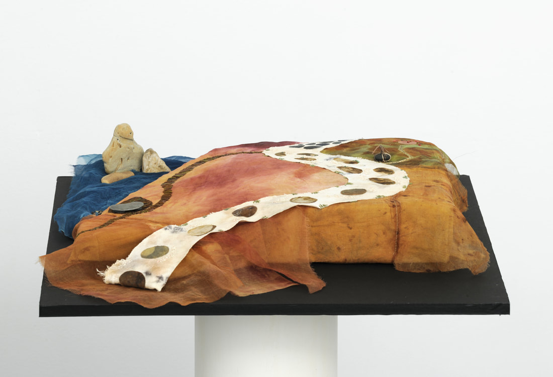
Photo by Rico Tudor
|
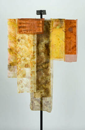
Photo by Patrick Fraser
|
Time: Space • Motion • Illusion
Shadows of Time “Time flies over us, but leaves its shadow behind.” —Nathaniel Hawthorne What is happening in the shadows—imprints that time creates? A ‘memory on cloth’ — a record of time through patterns, texture and stitching. Layered glimpses of images reflecting my last six decades. Process: Botanical plant eco printing, natural dyes, kakishibu, shibori on silk and cotton. Stencil and Theromfax printing. Pitt pens on acid free tracing paper. Sashiko stitching. |
|
Boxes: Treasure • Structure • Expression
Water My piece represents water as a treasure box. It is shaped as Lake Michigan. Water is always close to my heart. I have always lived near a lake, except one year and I was miserable! Being close to water soothes my soul. I am a water sign, a true Pisces. That’s me, two fishes swimming in opposite directions. And happiest when near water. Water is truly a treasure. It is a sacred commodity that needs to be respected and not taken advantage of. Please use our precious commodity wisely! Process: The piece is constructed in three layers. First I cut the Lake Michigan shape out of foam core and lined it with wooden skewers. I then covered this frame with Fosshape™. The shape is covered with silk fabric that I had hand dyed with indigo going from dark to light using a shibori technique. The fabric was then stitched and beads were added. The lining is silk, shibori dyed in indigo and Kakishibu. The feet are Swarovski crystals. |
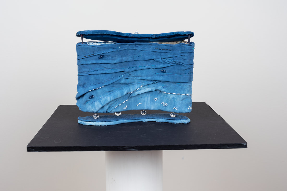
Photo by Patrick Fraser
|
|
Birds: Imagined • Natural • Symbolic
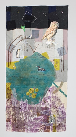
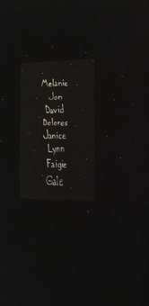
Birds in Paradise This piece is an homage to my friends who have passed away. The setting is surrealistic in nature playing with size, perspective, text and found objects. The scene consists of three parts. The bottom shows the cattails surrounding Honey Lake; above Honey Lake is a savanna if you will; at the top is the night sky. Each bird or creature represents a friend, as well as the two “stars” in the night sky. The constellation Apus is Bird of Paradise. I was inspired by the Chicago Botanic Garden Japanese Garden Bridge sign stating – In Japanese gardens, bridges carry people across water either real or imaginary. They also symbolically link one world to another – man to the gods, this world to paradise, the world of man to the world of nature. Process: The piece is constructed using a quilt map technique by Valerie Goodwin http://www.quiltsbyvalerie.com. The bottom was created using a Thermofax replication of a photo silkscreen I had done in college. The birds are photographic images fused on fabric. The lake is my hand dyed silk. Beads and sticks were added as found objects and embellishment. Photo credit for images in piece: Owl, Trebol-a; Penguin, Samuel Blanc; Bluebird, Sandysphotos2009; Loon, John Picken; Phoenix, dvarg. Zebra painting by Melanie Z. Asquith. |
|
Footwear: Women’s Stories
Cattail Memories on Honey Lake I grew up in North Barrington around Honey Lake till I was ten. Back then it was mostly farm land. There was a barn on the property and fields all around my house. I always played outside. In the summer you could find me swimming in Honey Lake. Thus began my love of nature. I chose to create sandals, because flip flops remind me of childhood and being at the beach. (Although I always went barefoot.) They are a child’s size. The sandals were designed from the heel vantage point. The right sandal reflects an underwater perspective and the left sandal the water’s surface. The cattail image, as well as the water lilies and its sister flower the lotus, are a recurring theme in my work. |
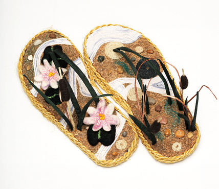
Photo by Rico Tudor
|
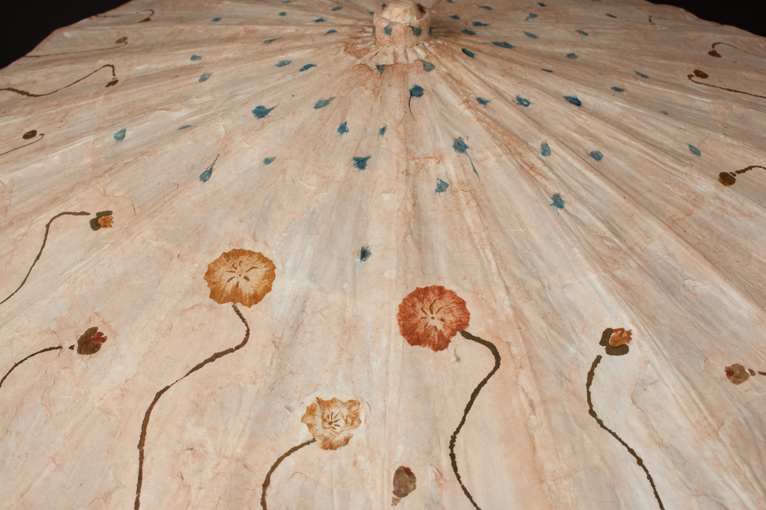
Photo by Patrick Fraser
|
Umbrellas: Open to Ideas
My Dad My umbrella represents my effort to be more “open” to the loss of my father. My dad tried to pass on many gardening tips to me, but when it came to gardening, I wasn’t a very good listener. Now I’m hoping that I just absorbed the knowledge. My dad enjoyed growing Iceland Poppies for over half a century. Champaign Bubbles were his favorite variety. He’d say “Look at those flowers—they look like paper!” I was taught to always burn the stems before placing them in water. While I can’t remember why, these tidbits of knowledge stay with me, close to my heart. |
|
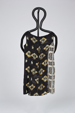
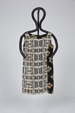
Paradigm Shifts: Impressions of Change
Shifting Between Computer and Hand In the mid-eighties I worked for one of the first Macintosh software publishers. I have a degree in graphic design with a focus in surface design. With the advent of desktop computers, I began to use my graphic design degree in desktop publishing. Years later I actively sought out surface design workshops where I could go back to working with my hands on fabric. My Par-A- Digm shift represents the shift of my work between computer and hand printed fabric. The front of the dress is a photograph that I manipulated in Photoshop® and then up loaded to a digital textile printer. Using elements from the digital fabric, I created the hand printed fabric with the Japanese technique, Nassen. It was challenging to create the repeat pattern the old fashion way, but I was determined not to use the computer. Rather than having a “front” and a “back” of the dress, I chose to wrap the two techniques around, illustrating my constant shifting between creating on the computer and creating by hand. |
|
Photos by Patrick Fraser
|
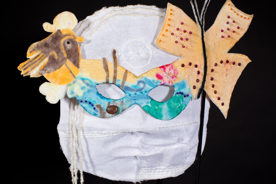
Photo by Patrick Fraser
|
Masks: Disguise • Expose • Celebrate
Who Do You Reveal to the World? How much of our personality do we share with others? How well do we really “know” somebody else? These are questions that inspired my mask. I chose to do white-on-white on the inside. The inner mask represents the part of one’s personality that is private. The embroidery and yarn are symbolic of things I keep private. The outside is in color. The outer masquerade mask is what we show to the world. The robin, butterfly and water scene represent the past, present and future. They are recurring images in my work. |
|
Apron: Myth Memory Fantasy
Breathe I began the process thinking I would create an apron based on memories, but it evolved into fantasy. My apron incorporates images from the past and present that I use to keep myself grounded thus “protecting” me as an apron should. The circles aligned down the center represent the chakras (centers of distribution of energy throughout the body). Each circle displays the corresponding chakra color, but the symbols within are my own. The inspirational words in the bark of the tree are from yoga and NIA classes (thank you Lisa and Myrna). The colored ruffle that create the apron strings is the aura that flows around us. The imagery is not meant to be a religious statement, but rather represents a journey of self awareness. Special thanks to my pattern & seamstress diva Nancy, my sensei and all my friends who helped me to perfect my vision. Enjoy your journey. |
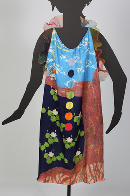
Photo by Patrick Fraser
|